The Second City
The Second City
The Second City called on Petrick Design to advise them on an overall branding strategy. We evaluated their existing material and created an organizational structure to more clearly brand and unify their look. We re-drew the original 1959 logo to bring it up to date, created graphics standards and developed a distinct approach for advertising and marketing. This system was formalized and adopted by their in-house designers in Chicago, Toronto and Los Angeles.
“Robert Petrick performed miracles for Second City. He combines humor, business acumen, and thought leadership – it’s an awesome combination.”
Kelly Leonard, Executive Producer,
The Second City
For this client, we provided:
Design Consultation
Writing, Message Development
Logo Design
Brand Development
Brand Management
Corporate Identity Systems
Communications Programming
Collateral Design
Advertising
The redrawn Second City logo.
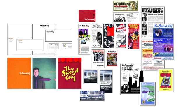
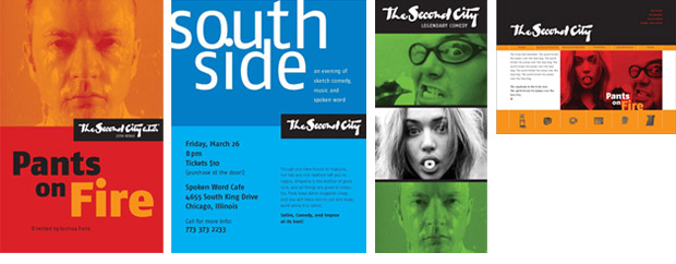
(Top image – Before; Bottom image – After) A communications audit revealed a lack of consistency in ads and marketing material. Petrick established a “frame” approach and standardized the use of the logo, delivering a system that was organized yet flexible and durable.
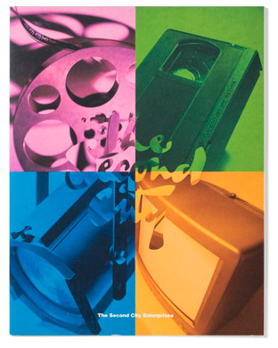
This press kit cover represents the four main segments of the Second City business.
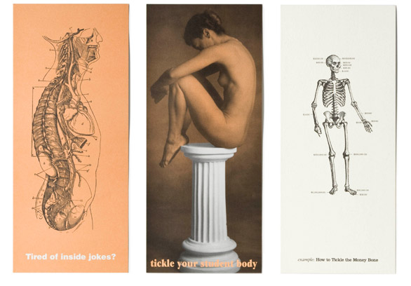
A series of direct mail postcards was created for targeted audiences, e.g. physician groups, colleges and HR professionals.
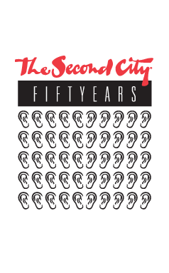
Humor finds its way into this logo concept for Second City’s 50th anniversary.
Comments are closed.