Chicago Cubs
Chicago Cubs
In the dead of each Chicago winter, thousands of die-hard Cub fans gather downtown for three days of baseball fever. For nearly a decade, Petrick Design has helped the Cubs brand this event, the proceeds of which help fund Cubs Charities. We develop a graphic theme that unifies elements such as program guides, event passes, signs, pins and tee shirts.
For this client, we provided:
Strategic Positioning
Design Consultation
Writing, Message Development
Collateral Design
Signage
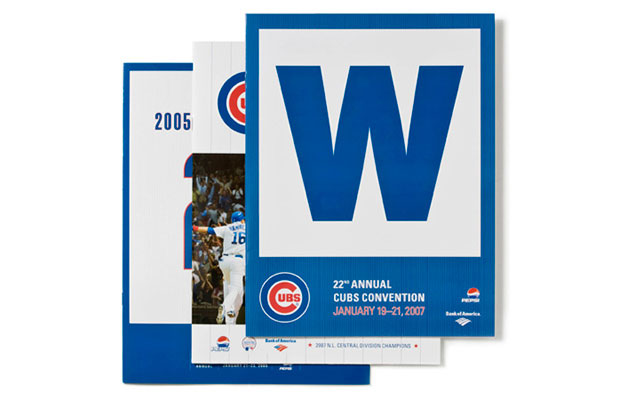
Petrick advised the Cubs to exploit Wrigley Field’s famous blue “W” as a marketing device.
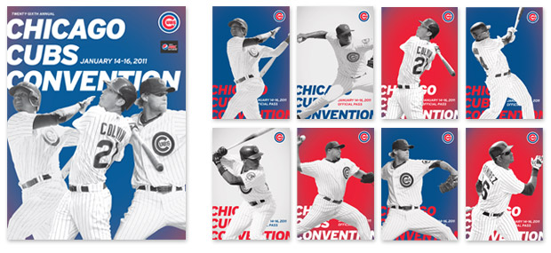
Convention passes for this year came in eight varieties so attendees could trade and collect them, like baseball cards.
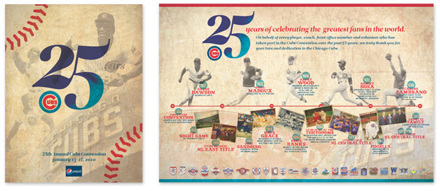
The 25th Anniversary Convention featured a poster timeline.
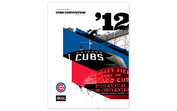
The program cover for the 2012 Convention exhibited a modernist theme.
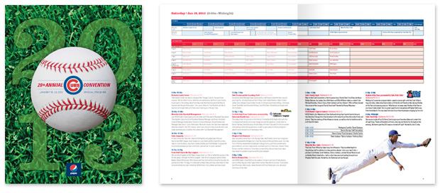
Petrick re-designed the event schedule into a user-friendly “TV Guide” format.
Comments are closed.