College of DuPage
College of DuPage
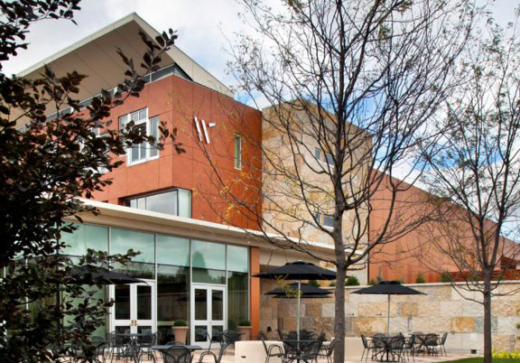
The College of DuPage’s new Culinary & Hospitality Center was created to train future chefs, hotel managers and supporting staff, while servicing actual customers in their boutique hotel, Inn at Water’s Edge, and fine dining restaurant, Waterleaf. Our branding solution was to create a single symbol that could serve both entities. Working in conjunction with the architect, our design and color palette were directly inspired by the “wing” element and surface materials of the new building.
“Robert used insight to create an identity that truly reflects the character of our institution.”
Laurie Jorgensen, Director, Marketing and Creative Services, College of DuPage
For this client, we provided:
Design Consultation
Brand Development
Brand Management
Logo Design
Corporate Identity Systems
Signage

A custom-drawn “W” echoes the distinctive “wing” of the building; this single symbol unifies the two main entities, Inn at Water’s Edge and Waterleaf Restaurant.

The “wing” element of the architecture that inspired the trademark; illuminated signage is mounted to the stone wall.

The typography for signs was carefully chosen to reflect the new symbol.

Strategic positioning of the symbol sign on the building ensures a link between the visual elements.
Comments are closed.