Old Town School of Folk Music
Old Town School of Folk Music
The historic Old Town School of Folk Music is the largest community arts school in the country, serving over 6,000 students a week. Petrick Design was chosen from 28 design firms for the coveted assignment of creating a new and lasting identity system. We designed the core symbol, created a complete brand identity system, and helped implement the system through signage, collateral, merchandise and advertising.
“Robert is a keen observer…[he] worked to develop a design concept that is an expression of our heritage, who we are and what we aspire to become.”
Bau Graves, Executive Director,
Old Town School of Folk Music
For this client, we provided:
Design Consultation
Writing, Message Development
Brand Development
Brand Management
Logo Design
Corporate Identity Systems
Communication Programming
Collateral Design
Advertising
Signage

The symbol for the Old Town School is the letter O, a forte symbol, a sound hole in a string instrument and a dancer, among many other evocations.
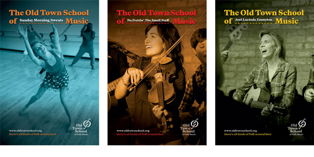
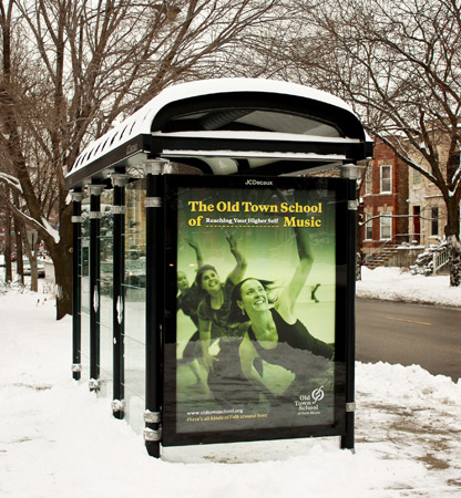
An ad campaign shows that “folk” can mean many different things (photography by Steven E. Gross).
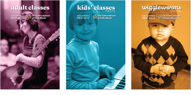
This collateral program for class schedules targets different age levels (photography by Steven E. Gross).

Mayor Rahm Emanuel speaking at the ribbon-cutting ceremony for the new building.

The symbol rendered in appliqué is an example of its adaptability.
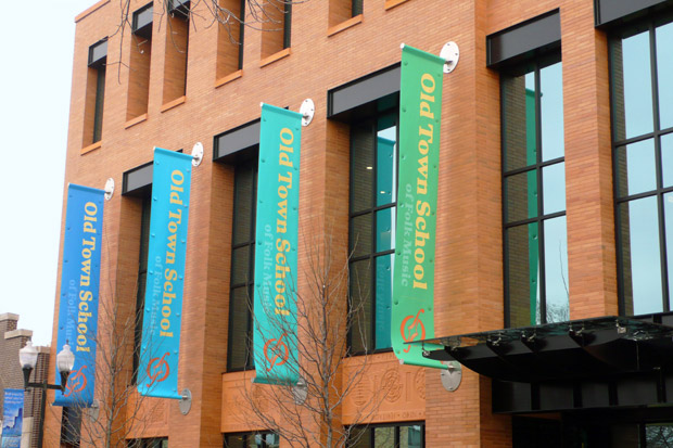
Banners in gradient colors identify the new facility.

The original building (the former Hild Library in Chicago’s Lincoln Square) was retrofitted to bear the new identity.
Comments are closed.