Ryt-way
Ryt-way
Petrick Design worked with Ryt-way – a contract packager of food – to develop its brand position, mission and vision statements. For their identity, we chose to leverage their vintage name in a contemporary way. Our design solution plays off the idea of making the “right turn” by placing a custom-drawn “r” inside the shape of a road sign. The tag line is “packaged” with the name in a message that defines the brand position.
For this client, we provided:
Strategic Positioning
Corporate Identity
Writing, Message Development
Brand Development and Brand Management
Logo Design
Corporate Identity Systems
Communications Programming
Collateral Design
Advertising
Signage
Trade Show Displays
Exhibit Design
 The Ryt-way trademark is a visual play off of a “right-turn” road sign.
The vintage name of the company is given a modern twist by “packaging it” with the tag line.
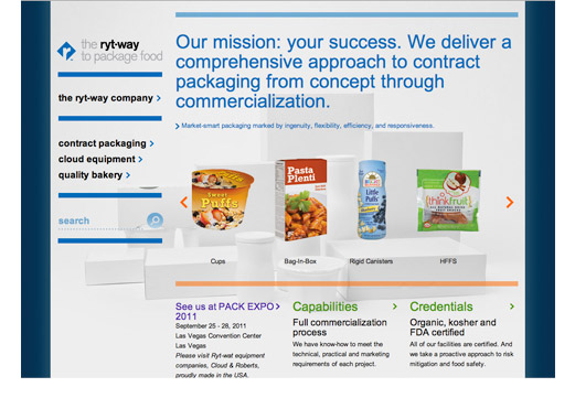
The Ryt-way website establishes the corporate color scheme and a clean, clinical look.
![]()
A family of diamond-shaped icons represents Ryt-way’s main areas of expertise.

A poster series leverages the branding elements to extend messages to internal audiences.

Ryt-way’s wholly owned subsidiary, Cloud Equipment, is re-branded to have a “Ryt-way” look and feel.

In order to reflect the superior nature of Cloud Equipment, Petrick developed the tag line “Nothing Reigns Like a Cloud”.
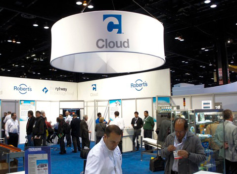
Petrick provided design consultation on the Cloud/Ryt-way trade show booth (photography by Ron Wu).

Petrick designed this modern and minimalist pedestal sign outside Cloud’s Chicago headquarters.
Comments are closed.